
Increase your website conversions with better typography
I’ve gathered 7 tips & tricks THAT WORKS!
By Camilla Asra Engelby

I see it on websites all the time. A lot of good intentions but that final crucial touch is missing. The thing that makes me finish that article, buy that product or sign up for an event. Just this morning I gave up on finishing an article. And all because of poor typography.
And it’s quite sad really when a few simple changes can get you across that finish line. That’s why I’ve put together these 7 solid tips and trick to help you increase your website conversion you can get those sign-ups, sell those tickets or whatever your aim is.
It’s hardly rocket science, but as a trained Graphic Designer the typography tips & tricks that I’m giving you here are part of my basic toolbox, and I use them all the time. Use them, don’t use them – it’s entirely up to you. But I guarantee you that it works!
001 – Avoid text lines that are too wide. Or wave goodbye your reader

You probably know it all too well. That thing where your eyes lands on the same line that you just read. Sometimes your eyes are simply tired but quite often though, the culprit is text lines that are simply too wide.
A good rule of thumb is to keep your lines below 65–70 units per line – and that’s including spaces.
Don’t worry that there’ll be a lot of space where your lines were before. That’s the ‘negative space’ which is where your readers eyes will find rest.
002 – Hands of that justified text button

And here’s the thing that made me give up on reading an article this morning. A case of really bad typography: Justified text. Not because justified text can’t look nice. But only with auto hyphenation (and even this can go awry if the column is too narrow).
When you opt to use justified text the words are simply spread out to fill the entire width of your column, and of this results in some very looooooong spaces. It’s as if the words are shouting at each other (on account of them being so far apart). The spacing will be random sizes from line to line. And you’ll end up with a phenomenon knows as ‘rivers’ in your text.
Justified text is also significantly more difficult to read especially for dyslexic users.
So what should you choose? Just simply use left aligned text, and your text will flow beautifully with even spaces throughout the entire column. And then your readers eye won’t have to adjust to different sizes of spacing for every line. And it’s joy to read.
And yes, this will make the right edge more uneven. But typographic research has proven that this is in fact easier for the eye to read. Left aligned text is the way to go!
003 – Bad typography makes it too hard for the lazy brain to skim

- No one reads anything
- Or, off course they do
- You’re reading this
Or did you skim it? Most people do. And just to be on the safe side, why not make your text skim friendly? That way your reader won’t have to use their brain too much to decode your message.
Skim friendly, whatever is that? Start by dividing your text up in bite size portions. Ad in some appetising sub-headers. Oooh, and ad a bullet list, I love me a bullet list it’s simply so to the point.
004 – Imagine a breathtaking image of Lady Gaga
(this probably would have worked better if the image was actually here)

Now that you’re at it with pleasing your skimming reader. Add some inviting images to support your copy. Something eye catching that creates and interest in your content.
If your reader has taken an interest in and image or graphic that will significantly increase your conversion chances. Basta.
005 – OOOOOOOOOOHHHHMMM, create harmony and beautiful typography with order

You need some zen, some harmony. I mean you could just throw all your elements onto the webpage at random and call it chaos typography, it would be super retro. But it won’t win you those clicks and conversions you so desire.
Make sure that there is coherence in your elements. Try to imagine and invisible grid. In the graphic world we work with ‘grids’ all the time. It’s in this invisible grid that you add your and align your blocks of text, subheads, images, graphics, etc.
006 – All the colours of the rainbow

Here I’ve allied myself with a couple of scientific research. I almost feel that the graphic could stand on its own here. But seeing as you’ve read this far, I’ll add a few comments.
When I tell that some colour combinations are inferior to others when it comes to legibility, it doesn’t mean that you have to avoid these like the plague. Take for instance black and purple. There are countless of purple nuances. I could easily imagine that a light lavender combined with black would have excellent legibility. And I’ll also quickly add that your choice of font is also an important factor here. But that’s a whole blog post in it self.
In any case, I strongly recommend that you consider it carefully when choosing colours.

And one more thing … Reading through various studies on legibility and colours I noticed that green text on red has scored high in legibility. But here you might ask what about red / green colour blindness. In any case, I would recommend against you making a ‘call-to-action’ button in a colour combination with those colours.
007 – No, thank you to gut feelings. Yes, thank you to split testing!
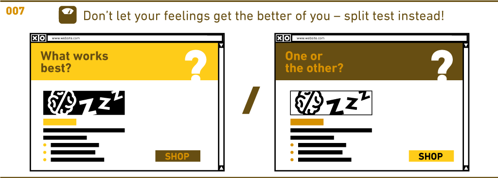
There are things I have strong feeling about and you probably have that too. But if you want to increase your conversion rate, then you have to – roughly speaking – stop feeling and start split testing instead. And it really doesn’t matter if you’re advertising on social media, making a landing page, or sending out emails.
How else will you know which image is converting best? Or whether your ‘call-to-action’ buttons have the right shape or colour? Or if your typography is on point? Etc.
What is best? It’s a test!
Get to work!
Privacy statement | Cookie policy | Disclaimer | Imprint | Copyright Camilla Asra Engelby